|
|
Post by fwalum on Sept 21, 2010 18:58:24 GMT -5
I can resonate with the "facelessness" and difficulty to identify with the new crusader. PC wins again! But as far as attitude is concerned, the old Crusader was losing it. It wasn't due to any fault of his own, but the management of the mascot was not very good. Half of the home basketball games saw NO Crusader in attendance, and when he was there, his presence was hardly felt. The year before, Redrick Taylor did a fine job playing the part, but last year was lackluster at best. This year the Crusader is staffed by 3 paid students who auditioned for the part, and then recieved mascot training from some esteemed trainer of mascots. At least they will have an idea of what a mascot is supposed to do during games and will know how to get a crowd fired up! Also, the new crusader will have a more constant presence at a wider variety of sporting events and will show up to more than home the men's Butler Basketball game on ESPNU. So although the appearance of the new mascot may not initially impress, I am confident that his Character on the sidelines will. I tend to agree with deea2, just give IT(  some time. Why should the university, students and alumni settle for anything less then a respectable looking mascot portraying a competitive yet fun image along with trained students to portray that image? The poll, although unscientific, overwhelmingly says that the appearance of the mascot is sub par. The students must be doing a good job. |
|
mj
Bench Warmer

Posts: 124
|
Post by mj on Sept 21, 2010 19:24:43 GMT -5
Probably because it allowed them not to watch the football game...
People are claiming "IT" is a better mascot than the old Crusader. But they haven't said what makes "IT" better. I'd like to hear the positives of this thing. Because it's pretty clear what the negative aspects of "IT" are.
|
|
rink
Bench Warmer
Posts: 198
|
Post by rink on Sept 21, 2010 20:27:29 GMT -5
I'm still in disbelief that the same institution from which I received my business degree could launch a high-profile, public-facing marketing material as bad as this mascot. It's gotta be one of those "so bad it's good" / viral marketing type things. Someone's dad actually put that that abortion of creativity together in his garage for his kid's elementary school somewhere in NW Indiana, and the PR guys are just clowning to create buzz while the real, professional, dignified, exciting, pride-inspiring version of the mascot is being worked on by the kind of top-tier company that would be comissioned to produce a mascot for a prestigious and sophisticated University.
|
|
|
|
Post by milwvu04 on Sept 21, 2010 22:51:37 GMT -5
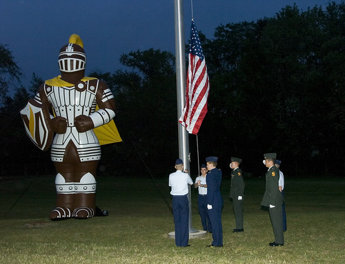
Why should the university, students and alumni settle for anything less then a respectable looking mascot portraying a competitive yet fun image along with trained students to portray that image? Exactly! We all agree that the giant blowup Crusader that was at the football game was awesome Any pics? How would you change the Crusader to make it look better? Adding a bit of the Joker might help...  Actually, as I've stated I think it might work if it were completely humanized, like the WV Mountaineers. Wasn't the Uhlan or an early Crusader depicted on horseback? That would be neat, although I don't think it would work well storming across Homer Court and that is where Valpo is more often seen on a national level. The gold on brown simply doesn't work. Maybe if gold or white had been the primary colors with brown accents or even the dreaded lime green (which I don't have a problem with) would have brightened it up somewhat. Here is the shield some thought was missing. It appears that the students managed to take the shield and I doubt it put up much of a fight.  I happen to like the shield, which is using the color scheme I mentioned. If the crusader had been white, it may have looked better. He looks more like a samurai warrior than a crusader. There should be cloth covering mail. The logo would have looked great on the chest. <edit> I think the cloak is fine. It is fairly common on images of crusaders.<edit>  Think all white with gold accents and the V logo in place of the crosses. |
|
valpo95
Bench Warmer
Crusader Fund Contributor
Posts: 160
|
Post by valpo95 on Sept 22, 2010 7:41:49 GMT -5
After reading the responses, we need to distinguish between having well-paid, well-trained and enthusiastic actors who put on a costume and the particular features of the costume. We're all in favor of getting the right people to play the part, and I have no doubt that makes a difference to fans, kids and the community.
Maybe it is just that I haven't seen IT in person, but based on the pictures, I'm just not impressed with the new mascot costume.
|
|
|
|
Post by jerome1 on Sept 22, 2010 8:15:33 GMT -5
That can't be real. It's like a cheap halloween costume painted brown. Seriously ... those fly-by-night halloween stores that are only around for a month sell pathetic junk like that for $30 every October. It's a Batman/He-Man/Mighty Morphin Power Ranger costume with a giant cylindrical helmet. This is just some student's homemade attempt, right? Right??? No way an actual University tries to pass this off as a mascot. Come up with something new, rink. You're answers are totally predictable. There's nothing new. You say the same thing about every Valpo subject line. |
|
rink
Bench Warmer
Posts: 198
|
Post by rink on Sept 22, 2010 10:47:16 GMT -5
Come up with something new, rink. You're answers are totally predictable. There's nothing new. You say the same thing about every Valpo subject line. Not sure what to tell you. I'm constantly disappointed by what I see from the University. I'll grant you, I'm of the type that more freely voices criticism than praise. It's my style, and I think it's reasoned. (Praise a University for succeeding at a few things here and there? It's their job to succeed at things. I'm not going to get too excited when things are done right.) I care greatly about the reputation of VU. Greatly. And it saddens/frustrates/angers me to endure repeated examples of public embarassment. - ESPN tickers showing VU slaughtered by no-name schools in football. - Publications like US News broadcasting pitiful acceptance rates. - Ditto on unimpressive ACT scores. - A men's basketball program that failed to capitalize on national exposure and now watches from afar as other mid-majors have become household names and factor in the NCAA every year. - A campus plan that seems generally sloppy and directionless. - A questioable new logo followed by a mascot that's hideous, and now being laughed at by fellow HL schools. (When our existing mascot was pefectly fine, the exact look and feel you'd expect from a respectable college, on par with anything in a major conference.) Sorry if I'm repepitive, Jerome. I'm very hopeful that someday I won't be so bombarded and inundated with shame around every corner when it comes to what I see from VU. In the meantine, I just can't pretend everything is okay and blindly accept the slow slide into mediocrity and faded prestige. |
|
|
|
Post by okinawatyphoon on Sept 22, 2010 14:22:30 GMT -5
Come up with something new, rink. You're answers are totally predictable. There's nothing new. You say the same thing about every Valpo subject line. Not sure what to tell you. I'm constantly disappointed by what I see from the University. I'll grant you, I'm of the type that more freely voices criticism than praise. It's my style, and I think it's reasoned. (Praise a University for succeeding at a few things here and there? It's their job to succeed at things. I'm not going to get too excited when things are done right.) I care greatly about the reputation of VU. Greatly. And it saddens/frustrates/angers me to endure repeated examples of public embarassment. - ESPN tickers showing VU slaughtered by no-name schools in football. - Publications like US News broadcasting pitiful acceptance rates. - Ditto on unimpressive ACT scores. - A men's basketball program that failed to capitalize on national exposure and now watches from afar as other mid-majors have become household names and factor in the NCAA every year. - A campus plan that seems generally sloppy and directionless. - A questioable new logo followed by a mascot that's hideous, and now being laughed at by fellow HL schools. (When our existing mascot was pefectly fine, the exact look and feel you'd expect from a respectable college, on par with anything in a major conference.) Sorry if I'm repepitive, Jerome. I'm very hopeful that someday I won't be so bombarded and inundated with shame around every corner when it comes to what I see from VU. In the meantine, I just can't pretend everything is okay and blindly accept the slow slide into mediocrity and faded prestige. I wanted to address a few points here. First of all, average ACT scores and GPA for incoming freshmen are at some of their highest levels in history. Sure, they aren't as high as we'd like them to be, but they are improving. As far as acceptance rates, they don't tell the whole story. Look at Chicago State University, for instance. They have an acceptance rate of 56%, which is much better than Valpo's 90%. Right? Well the average ACT score of an incoming student at Chicago State is between a 16 and 19, whereas the average for a Valpo student in this class was 26. Sure, we want to lower the acceptance rate, but acceptance rates aren't everything. I personally like the new logos and marketing, and most students and staff will agree too. Now the mascot has caused some contention, but most seem to be in favor of the new logos and plan. I haven't heard other HL schools mocking or making fun of our logos or marketing, just the mascot. The campus plan makes a lot of sense....have you read it? Just know that it takes time for things to improve and they have been improving at a steady rate. |
|
|
|
Post by rlh on Sept 22, 2010 14:59:11 GMT -5
President Heckler addressed or Valparaiso Kiwanis Club today at noon and I can assure you that there is a plan for new buildings and improvements on the campus. Many that I was surprised to hear and a 19 year plan that will involve about 300 million needed to fulfill. In addition, there seems to be a very origanized plan for student growth up to the level of 6000 students without lowering the admission standards for the school. I'm not an alum, but work very closely with the university in my career....and it seems to me that the plans for the future are solid and certainly in place. I too think the mascot is laughable, but maybe we'll all get used to it. The shield I like and the branding of the university makes perfect sense...not sure who's nightmare the costume came from, but it is what it is....Why anyone is embarassed by Valparaiso University is beyond my comprehension.
|
|
32
Recruit
Posts: 49 
|
Post by 32 on Sept 23, 2010 17:42:36 GMT -5
These last two posts are examples of the biggest risk on the mascot disaster (it can be called nothing other). Here is the link from other HL schools mocking VU: pantheru.wordpress.com/2010/09/20/valpos-new-mascot/The other risk the VU leaders cannot fall into is “but maybe we'll all get used to it”. I am sure that is what folks are hoping as it has been the way at Valpo for a long-time. VU needs to accept defeat, make sure that thing is burned before the weekend, and hire a firm to do this right. VU would win a lot of fans by using this experience to show they actually listen to the students and alumni. This would be a real paradigm shift for them. PS. Does it bother anyone that VU has the only alumni magazines where there are no letters to the editors in the front? |
|
mj
Bench Warmer
Posts: 124
|
Post by mj on Sept 23, 2010 21:12:28 GMT -5
This was a comment posted on PantherU's blog by someone named Dee. I'm assuming the poster named deea2 on this forum is the same person.
Maybe it's just me but that explanation of the new mascot really bothers me. I'd love to know which person came up with the idea. Or was it the product of groupthink? People "identify and bond" with a mascot because of the results on the field/courts of athletic play. No because the mascot looks like them. The whole idea sounds like it comes from a person or people who've never followed sports in their lives
|
|
|
|
Post by milwvu04 on Sept 24, 2010 23:51:07 GMT -5
|
|
|
|
Post by melmellis on Sept 25, 2010 1:43:37 GMT -5
I am a fan of the inflatable. Brown + gold + white definitely beats the brown + gold + grey thing the mascot costume's got going on.
Does anyone know if they painted over the old crusader by the pool? I always thought it was a bit amusing that he was swimming in full body armor, but maybe he was just that impressive of an athlete.
|
|
|
|
Post by blackpantheruwm on Sept 25, 2010 10:12:53 GMT -5
The inflatable's actually pretty cool. Now that I look at it, and look at the mascot, I think the problem (besides the brown chestplate) is the proportions. The inflatable showed me that the crusader needs to have bigger, broader shoulders to compensate for the giant head.
And the name, Valhalla. Or maybe that name sucks. I'm just stuck on Norse mythology because the nickname "Norse God of Defense" is sticking to Clay Matthews.
|
|
rink
Bench Warmer
Posts: 198
|
Post by rink on Sept 25, 2010 21:31:46 GMT -5
...the nickname "Norse God of Defense" is sticking to Clay Matthews. I'm liking Claymaker, personally. Clay, haymaker, playmaker ... Claymaker. But I digress.... |
|

 some time.