32
Recruit
Posts: 49 
|
Post by 32 on Aug 23, 2010 19:15:07 GMT -5
So where is the official website explaining all this and introducing this logo? Nobody would have a branding campaign and not communicate it very clearly. Where is the history and why we did it? What is the story behind the logos? How will it be used? What does the physical mascot look like? How will logos be incoporated into uniforms, clothing, etc? Typicall Valpo. Was huge news and very well organized when this happened where I went to grad school. www.cmu.edu/homepage/innovation/2007/spring/scottie-comes-home.shtml I think Labarbera did get posters on the old gym wall. Not sure what after that. |
|
|
|
Post by vu72 on Aug 23, 2010 20:58:36 GMT -5
So where is the official website explaining all this and introducing this logo? Nobody would have a branding campaign and not communicate it very clearly. Where is the history and why we did it? What is the story behind the logos? How will it be used? What does the physical mascot look like? How will logos be incoporated into uniforms, clothing, etc? Typicall Valpo. Was huge news and very well organized when this happened where I went to grad school. www.cmu.edu/homepage/innovation/2007/spring/scottie-comes-home.shtml I think Labarbera did get posters on the old gym wall. Not sure what after that. Pretty funny post! All that complaining and then you post a story about a dog! Hilarious. Try looking at the Valpo site. It might help. The mascot will be revealed at the first night football game. In the meantime, try this site for some info: www.valpo.edu/stories/valpo_unveil.php |
|
|
|
Post by crusaderjoe on Aug 23, 2010 21:35:57 GMT -5
Clearly, the first accent color that comes to mind when I think of a school that is located in NW Indiana and whose primary colors are brown and gold is citrus green.
Look for that Valpo athletic apparel to start flying off the shelves immediately.
:crazy
|
|
32
Recruit
Posts: 49
|
Post by 32 on Aug 23, 2010 21:37:35 GMT -5
That was helpful. Thank you...for the link.
|
|
|
|
Post by crusaderguy08 on Aug 24, 2010 0:43:13 GMT -5
|
|
|
|
Post by vu72 on Aug 24, 2010 7:32:38 GMT -5
Very cool!! Thanks so much for the pictures. Homer is getting the recognition he so rchly deserves.
Note to crusaderjoe: Being from South Florida you should be honored that they chose "citrus green"! Or maybe you would have preferred pink!!
|
|
|
|
Post by vusupporter on Aug 24, 2010 15:10:17 GMT -5
|
|
|
|
Post by okinawatyphoon on Aug 24, 2010 15:44:20 GMT -5
Thanks for the photos and for the links to the website! If anyone is unclear about the new branding initiative (new logos, messaging, designs, etc), please visit the website! Things are spelled out pretty clearly. For those wondering, the "official" unveiling is taking place right now at the Opening Convocation.
|
|
|
|
Post by kkgrad on Aug 24, 2010 16:50:58 GMT -5
Just ordered some new soccer gear on line with the new logos - I like it.
|
|
|
|
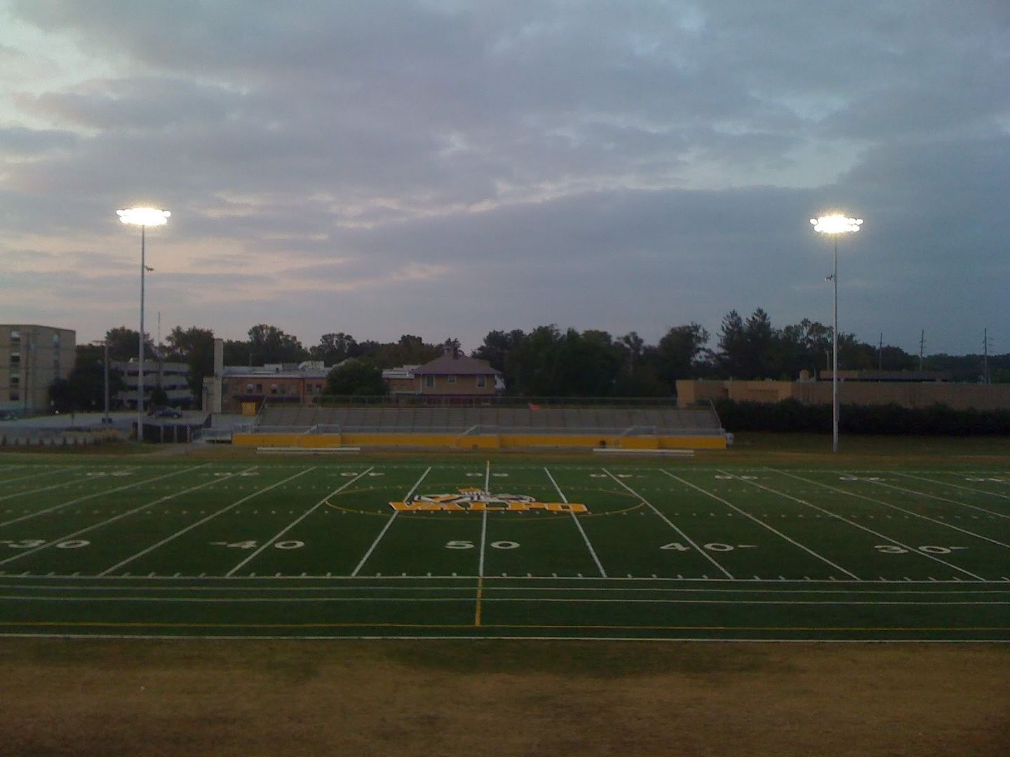
Post by vu72 on Aug 24, 2010 16:54:38 GMT -5
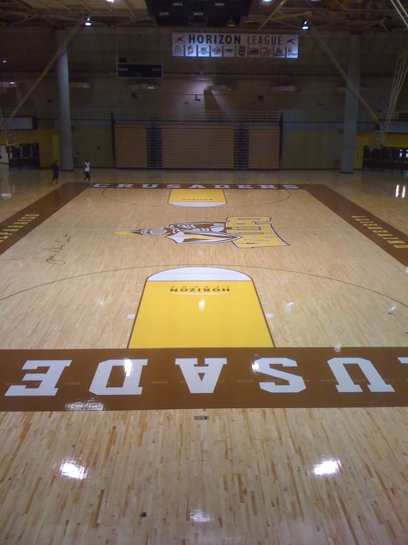
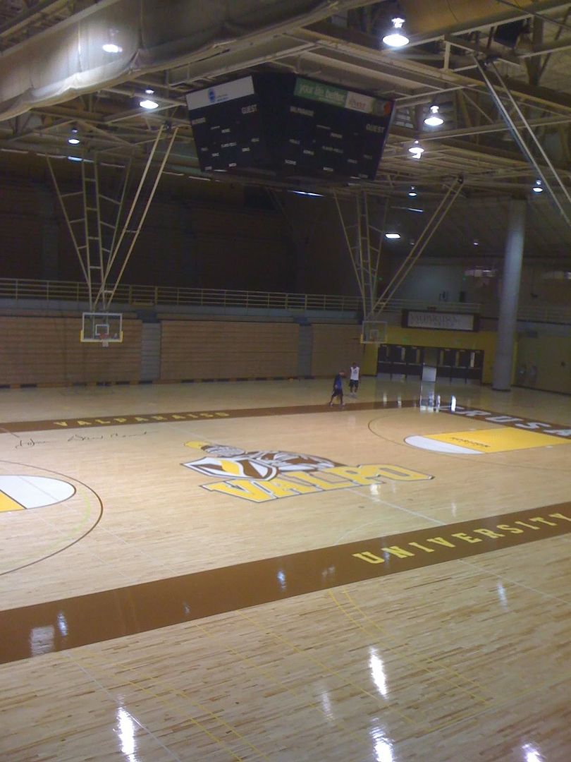
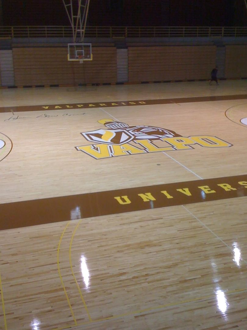
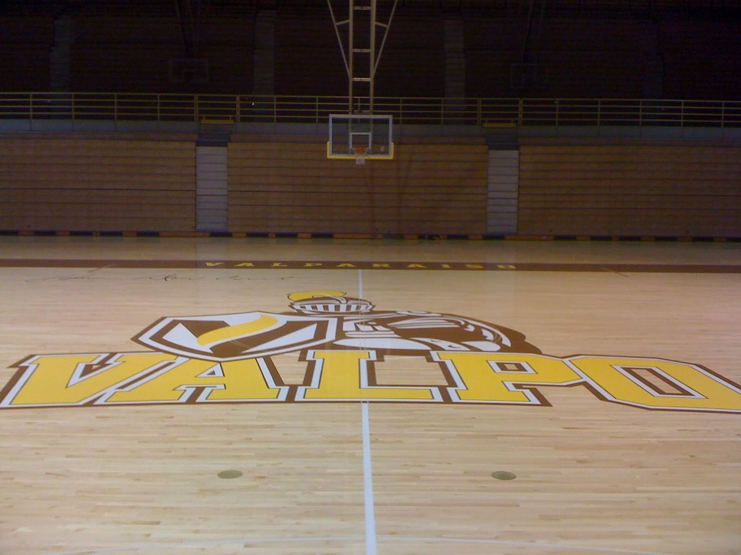
I didn't really think they would replace the Valpo swoop at the 50 yard line after only one year! They are really taking this seriously. Also, the new lights are very cool!!
|
|
|
|
Post by crusaderjoe on Aug 25, 2010 16:47:35 GMT -5
Very cool!! Thanks so much for the pictures. Homer is getting the recognition he so rchly deserves. Note to crusaderjoe: Being from South Florida you should be honored that they chose "citrus green"! Or maybe you would have preferred pink!! Not to turn this into the Project Runway forum, but I am looking at this color scheme for two reasons since it is clear that branding is very important to Valpo given all the changes: 1) appropriate trade dress and increased visibility; and 2) increase in sales of VU athletic apparel through the addition of appropriate color (functionality) So many possibilities to supplement two very very had colors to work with and they come up with this. Would you not agree that the color “citrus green” imports a tropical reference? How is that appropriate trade dress for a school located in Indiana? Since when did lemon or lime trees start growing in Porter County? IMO, I would have introduced a deep red or a maroon. You get far more possibilities with adding a color like that than you would an off color like "citrus green". You could easily create very sharp and marketable looking uniforms for all of Valpo’s sports teams. Baseball needs a third game jersey for a three game series? Fine, break out a nice red jersey a la the Houston Astros. Football wants to wear something special on a particular Saturday? Fine, roll out a sharp looking red jersey a la Notre Dame’s green. Basketball needs a third uniform? You've got a color that works--and that is marketable. Is citrus green really going to increase the sale of your athletic apparel? In Miami? Yes. In Hammond, Indiana? Probably not. |
|
|
|
Post by fwalum on Aug 26, 2010 13:06:10 GMT -5
I agree about the lime green. Really lacks the gravitas I think the institution needs and deserves. It is a terrible color to use for a "mouse over" on the website. Not really liking the new website so much. I know that the consistency of the old website was suspect but the new website is "OK" but not really doing it for me or some of the web designers I know. Also, what is with the gold and lime green "life lines" at the bottom of each web page and on the new letterhead?  ??  |
|
|
|
Post by okinawatyphoon on Aug 26, 2010 16:46:06 GMT -5
Red and maroon? While it may look nice, we certainly wouldn't stand out among the sea of maroon and red in the midwest. I for one really like the green, and many that I have spoken to agree. The green provides some much needed life to our somewhat dull (although unique) brown and gold color scheme. The green "life lines" are just that: life lines. The lines represent value (gold) and life (green) and the lines intersect at one point (the community). It's much more visually appealing than the rest of the garbage at the bottom of a website (which is usually nothing). Here is a webpage on the Valpo site describing the lines: www.valpo.edu/brand/designsystem/lifelines.php |
|
|
|
Post by fwalum on Aug 27, 2010 0:57:17 GMT -5
Sorry, maybe if the green were a few shades darker. We have these strong colors, yellow gold and dark brown being accented by this muted, frothy, light or lime green. I think we could have done better. Back to the lifelines. No one .... I repeat No one unless they are a diehard VU alumni, supporter, student or staff member will read the branding explanation after a few months in order to find out the meaning of the squiggly lines at the bottom of the page. Ninety percent of the people who visit the website will have no idea what the lines, their color and intersection represent (yes I had read the branding explanation before you posted it). The very fact that you had to explain them attests to their uselessness. If Jay Leno showed them to 1000 people on the street and asked what they represent, I would almost be willing to wager that NO ONE would say "Oh, those are lifelines...". Put something down there that is immediately recognizable as connected or having meaning to the university. |
|
|
|
Post by crusaderjoe on Aug 27, 2010 6:35:07 GMT -5
The changes VU made might be acceptable from an academic trade dress standpoint, but they are almost completely unworkable from an athletic trade dress standpoint, IMO. There is no academic or athletic consistency and that lack of consistency is to the detriment of athletics. You want proof of the inconsistency--just look at the logo on the athletic site. Where is the green? Why wasn't the color of "life" worked into the primary athletic logo? Because it would make the logo look putrid.
Just because these trade dress changes might look good on a piece of VU stationary that is being mailed from the registrar's office doesn't mean they can automatically translate well athletically. VU should have picked a color that was workable in both avenues.
|
|


 ??
??